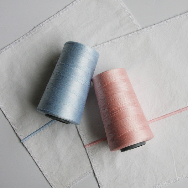

To much fanfare, Pantone recently announced their 2016 Colour of the Year, and for the first time ever, it's a tie! Many were surprised by their choice, dual shades of Rose Quartz (soft warm pink) and Serenity (soft cool blue).
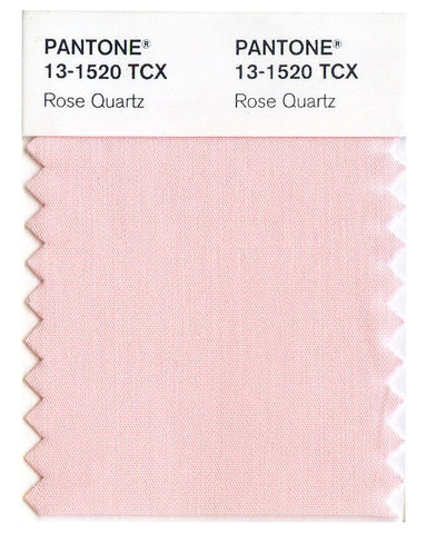
On their website, Pantone explains their process behind choosing these colours, and the reason for selecting two shades rather than the typical one. They see these soft shades as an antidote to the modern day stress that we all experience, and these soft shades psychologically fufill our desire for reassurance, calmness, and security.

They also share that the blending of the two shades is representative of the gender fluidity that is burgeoning in many parts of the world, and this societal trend has impacted the world of fashion and design. No longer is pink associated with girls and blue associated with boys; we're free to use colour in any way that we like it.
Want to get this look in your own home? Try our Loft 2-Line embroidered collection, with Pale Pink or Ice Blue embroidery.

